The 7 Best Font for Subtitles in 2026 for Ultimate Readab...
Discover the best font for subtitles to ensure maximum clarity and accessibility. Our expert guide covers the top 7 choices for any video project.
Kate, Praveen
February 25, 2026
Choosing the best font for subtitles is more than an aesthetic preference; it's a fundamental aspect of accessibility, viewer engagement, and overall message clarity. A poorly selected font can make your content difficult to read, especially for viewers with visual impairments or those watching on smaller screens like mobile phones. The right typeface ensures your dialogue and narration are delivered seamlessly, supporting your visual story instead of distracting from it.
Subtitles Are Only Half the Job
Choosing a great font improves readability, but you still need accurate, time-synced captions to make them useful. Without clean transcripts, even the best typography can’t save your workflow. Good subtitles start with precise text first — styling comes secon
This guide moves beyond generic advice to provide a detailed breakdown of the technical and design elements that constitute great subtitle typography. We will explore why factors like a large x-height, clear character spacing, and specific screen optimizations are essential for creating legible on-screen text. You will find a curated roundup of seven excellent fonts that perform well in various contexts, from global multilingual projects to content requiring top-tier accessibility.
For each font, we provide actionable tips on ideal sizing, weight, and styling. This curated list will help you make an informed choice that strengthens your video's impact and guarantees your message is understood by every viewer. We'll show you exactly how to implement your chosen font, making sure your subtitles are as professional and effective as the rest of your production.
Core Subtitle Workflow Features
Modernste KI
Angetrieben von OpenAIs Whisper für branchenführende Genauigkeit. Unterstützung für benutzerdefinierte Vokabulare, bis zu 10 Stunden lange Dateien und ultraschnelle Ergebnisse.

Aus mehreren Quellen importieren
Importiere Audio- und Videodateien aus verschiedenen Quellen, einschließlich direktem Upload, Google Drive, Dropbox, URLs, Zoom und mehr.
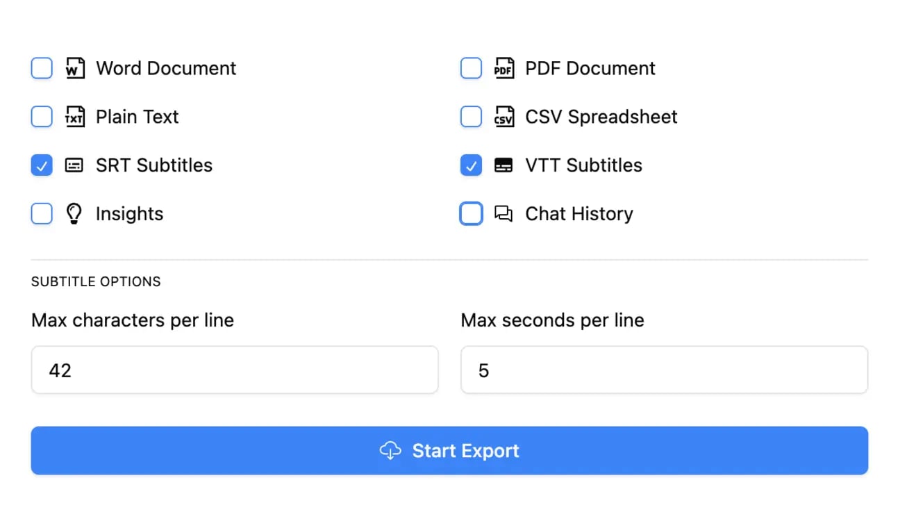
In mehreren Formaten exportieren
Exportiere deine Transkripte in mehreren Formaten, einschließlich TXT, DOCX, PDF, SRT und VTT mit anpassbaren Formatierungsoptionen.
1. Inter (Rasmus Andersson)
Inter ist eine moderne, neo-groteske Schriftart, die von Rasmus Andersson speziell für Computerbildschirme entwickelt wurde. Ihre hohe x-Höhe und offenen Buchstabenformen sorgen dafür, dass sie auch bei kleinen Schriftgrößen außergewöhnlich gut lesbar bleibt, was sie zu einer zuverlässigen Wahl für Untertitel auf verschiedenen Geräten und Auflösungen macht. Diese Schriftart wurde von Grund auf entwickelt, um die Lesbarkeitsprobleme zu lösen, die bei Benutzeroberflächentexten häufig auftreten, und diese DNA macht sie zu einer der besten Schriftarten für Untertitel heute.
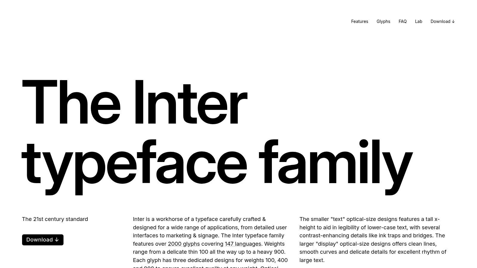
Als völlig kostenlose Open-Source-Schriftart unter der SIL Open Font License kann Inter für jedes kommerzielle Projekt ohne Lizenzgebühren verwendet werden. Sie können sie direkt von der offiziellen Website herunterladen. Ihre Verbreitung auf modernen Plattformen wie Figma und verschiedenen Web-Frameworks bedeutet, dass die Wahrscheinlichkeit geringer ist, dass Ihre gewählte Schriftart durch eine störende Systemstandard-Schriftart ersetzt wird, wenn Untertitel im Web gerendert werden.
How Clean Subtitles Transform Your Content?
Faster Editing
With a ready transcript, you can jump straight to exact timestamps instead of scrubbing the timeline. Finding a line takes seconds, not minutes. Editing becomes precise and stress-free.
Better Accuracy
Text lets you quickly spot mistakes, misheard words, or unclear phrases. Fixing captions visually is far easier than replaying audio again and again. Your final subtitles look professional.
Consistent Formatting
Once text is generated, you can apply fonts, sizes, and styles consistently across the whole video. No uneven captions or mismatched styling. Everything stays clean and branded.
Reusable Content
Your subtitles double as transcripts, blog posts, summaries, or social captions. One recording turns into multiple assets. You get more value from the same content.
Warum es für Untertitel funktioniert
Das Design von Inter stellt Klarheit über alles andere. Seine Zeichen sind deutlich unterscheidbar und verhindern häufige Verwechslungen wie 'I' und 'l'. Die Schriftart verfügt über ein umfangreiches Hinting, ein Prozess, der die Darstellung der Schriftart an das Pixelraster eines Bildschirms anpasst. Dies führt zu gestochen scharfem Text, der die Unschärfe vermeidet, die andere Schriftarten auf Displays mit geringerer Auflösung plagen kann.
Schlüsselerkenntnis: Die Stärke von Inter liegt in seiner Neutralität und technischen Präzision. Es lenkt den Betrachter nicht mit stilistischem Flair ab; es liefert einfach lesbaren Text, der sich auf jedem Bildschirm, auf dem er angezeigt wird, heimisch anfühlt.
Implementierung und Größenanpassung
Für die Implementierung von Untertiteln ist das variable Schriftformat von Inter ein erheblicher Vorteil. Es ermöglicht eine feine Abstimmung von Gewicht und Neigung, ohne separate Schriftdateien laden zu müssen. Dies ist perfekt, um Betonungen zu erzeugen (z. B. durch die Verwendung eines halbfetten Gewichts für einen bestimmten Sprecher), ohne die Effizienz der Untertiteldatei zu beeinträchtigen.
| Anwendungsfall | Empfohlenes Gewicht | Ideale Größe (relativ zu 1080p) | Hinweise |
|---|---|---|---|
| Standarddialog | Regular (400) | 48-56px | Eine solide Basis für allgemeines Betrachten. |
| Betonung/Schreien | SemiBold (600) | 52-60px | Sparsam verwenden, um visuelle Ermüdung zu vermeiden. |
| Flüstern/Zwischenrufe | Regular (400) | 42-48px | Kann mit Kursivschrift zur besseren Lesbarkeit kombiniert werden. |
Wenn Sie mit einem Tool wie Transcript.LOL arbeiten, können Sie Ihre Transkription als SRT- oder VTT-Datei exportieren. Obwohl diese Dateien keine Schriftarten einbetten, können Sie Inter in Ihrem Videoeditor (wie Premiere Pro oder DaVinci Resolve) oder über CSS für Web-Videoplayer angeben, um sicherzustellen, dass Ihre Untertitel genau wie beabsichtigt gerendert werden. Die breite Sprachunterstützung für lateinische, griechische und kyrillische Schriften macht sie zu einem vielseitigen Ausgangspunkt, obwohl sie Begleit-Schriftarten für CJK-Skripte erfordert.
Website: https://rsms.me/inter/
2. Noto Sans (Google)
Die von Google entwickelte Noto-Schriftfamilie wurde mit einem monumentalen Ziel geschaffen: alle Sprachen der Welt mit einer visuell harmonischen Ästhetik zu unterstützen. Noto Sans ist die serifenlose Komponente dieses Projekts und gilt als beste Schriftart für Untertitel bei der Arbeit mit mehrsprachigem Inhalt. Ihr klares, offenes Design sorgt für Lesbarkeit, während ihre Hauptaufgabe, die globale Sprachunterstützung, sie zu einem Kraftpaket für internationale Projekte macht.
Als Open-Source-Projekt unter der SIL Open Font License ist die gesamte Noto-Familie für die kommerzielle Nutzung, einschließlich Rundfunk und Web-Video, völlig kostenlos. Dies beseitigt komplexe Lizenzierungshürden, insbesondere für Unternehmen, die globale Inhalte verwalten. Der Schlüssel liegt darin, die Hauptschriftart Noto Sans mit ihren spezifischen regionalen Pendants wie Noto Sans CJK für Chinesisch, Japanisch und Koreanisch zu kombinieren, um ein konsistentes Erscheinungsbild über verschiedene Schriften hinweg zu gewährleisten.
Warum es für Untertitel funktioniert
Noto Sans zeichnet sich durch seine schiere Breite an Zeichenunterstützung aus. Wenn Ihr Video Untertitel in Englisch, Kyrillisch und Japanisch benötigt, verhindert die Verwendung der Noto-Familie störende Änderungen des Schriftstils und -gewichts zwischen den Sprachen. Die Zeichen sind so gestaltet, dass sie eine gemeinsame Höhe und Strichstärke aufweisen, was ein kohärentes Seherlebnis schafft, das nicht vom Inhalt ablenkt. Dies ist ein kritischer Aspekt für viele Ersteller, und Sie können verschiedene Untertitelanwendungen in verschiedenen Branchen untersuchen, um zu sehen, wie dies zutrifft.
Schlüsselerkenntnis: Die Stärke von Noto ist seine Universalität. Es bietet eine einzige, einheitliche typografische Lösung für Projekte, die andernfalls eine Mischung aus verschiedenen, oft nicht übereinstimmenden Schriftarten für jede Sprache erfordern würden.
Implementierung und Größenanpassung
Für die praktische Anwendung müssen Sie nicht die gesamte Noto-Familie mit mehreren Gigabyte herunterladen. Wählen Sie stattdessen die spezifischen Schriftdateien für die benötigten Sprachen aus. Für webbasierte Videoplayer bedeutet dies, dass Sie Noto Sans für lateinische Skripte bereitstellen und dann Noto Sans CJK nur dann aufrufen können, wenn eine CJK-Sprache ausgewählt ist, was die Ladezeiten optimiert.
| Anwendungsfall | Empfohlenes Gewicht | Ideale Größe (relativ zu 1080p) | Hinweise |
|---|---|---|---|
| Globaler Dialog | Regular (400) | 50-58px | Sorgt für Konsistenz über lateinische und CJK-Skripte hinweg. |
| Betonung (Alle Skripte) | Bold (700) | 54-62px | Das fette Gewicht ist in allen Noto-Familien klar und deutlich. |
| Sekundäre Informationen | Regular (400) | 44-50px | Gut für Texte auf dem Bildschirm wie Orts- oder Zeitangaben. |
Nachdem Sie Ihre Untertitel mit einem Tool wie Transcript.LOL generiert haben, können Sie Noto Sans in Ihrer Bearbeitungssoftware anwenden oder sie in der CSS Ihres Webplayers angeben. Da Noto eine Google Font ist, ist die Implementierung im Web mit der @import-Regel unglaublich einfach. Dies stellt sicher, dass Zuschauer weltweit eine konsistente, qualitativ hochwertige Untertitelspur unabhängig von der Sprache sehen.
Website: https://notofonts.github.io/
3. Source Sans 3 (Adobe)
Source Sans 3 ist eine vielseitige serifenlose Schriftart, die von Adobe entwickelt wurde und ursprünglich für Benutzeroberflächen konzipiert war. Ihre ausgewogenen und offenen Buchstabenformen in Kombination mit einer großzügigen x-Höhe sorgen für hervorragende Lesbarkeit auf Bildschirmen, was sich perfekt für Untertitel und Bildunterschriften eignet. Als eine der Flaggschiff-Open-Source-Familien von Adobe bietet sie eine ausgereifte, stabile und vorhersehbare Grundlage für die Erstellung klarer und zugänglicher Videotexte.
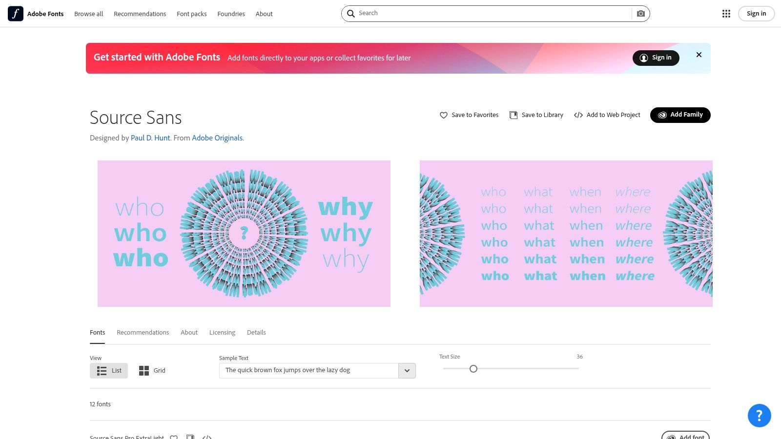
Kostenlos unter der SIL Open Font License verfügbar, kann Source Sans 3 einfach von Adobe Fonts oder Google Fonts heruntergeladen werden. Dies erleichtert die Einbettung auf Websites und die Bündelung mit Anwendungen, ohne sich Gedanken über Lizenzkosten machen zu müssen. Die nahtlose Integration in das Adobe Creative Cloud-Ökosystem (Premiere Pro, After Effects) bedeutet auch, dass Videobearbeiter sie ohne zusätzliche Installationsschritte verwenden können, was die Schriftkonsistenz von Design bis zum endgültigen Rendering gewährleistet.
Warum es für Untertitel funktioniert
Der Hauptvorteil von Source Sans 3 ist sein neutrales, aber professionelles Erscheinungsbild. Seine Zeichen sind klar unterscheidbar, mit ausreichendem Abstand, der verhindert, dass Buchstaben bei kleineren Größen verschwimmen. Die Schriftfamilie ist umfangreich und bietet eine breite Palette von Gewichten und einen kursiven Stil, der eine klare Unterscheidung zwischen Sprechern, Off-Screen-Dialogen oder hervorgehobenen Wörtern ermöglicht, ohne zu einer anderen Schriftart wechseln zu müssen.
Schlüsselerkenntnis: Source Sans 3 bietet Zuverlässigkeit und Vorhersehbarkeit. Ihre ausgereiften Metriken gewährleisten konsistentes Zeilenumbruch und Zeichenabstände, was für zeitgesteuerten Text, bei dem jede Millisekunde zählt, entscheidend ist.
Implementierung und Größenanpassung
Die vollständige Familie von Gewichten von Source Sans 3 gibt Erstellern präzise Kontrolle über das Erscheinungsbild von Untertiteln. Die Verwendung eines regulären Gewichts für Standarddialoge und eines fetteren Gewichts für wichtige Zeilen hilft, die Aufmerksamkeit des Betrachters effektiv zu lenken. Ihr variables Schriftformat ermöglicht auch sanfte Anpassungen und bietet unendliche Kontrolle zwischen den Gewichten für benutzerdefinierte Untertitelstile.
| Anwendungsfall | Empfohlenes Gewicht | Ideale Größe (relativ zu 1080p) | Hinweise |
|---|---|---|---|
| Standarddialog | Regular (400) | 46-54px | Ein sauberes, sehr gut lesbares Standardformat. |
| Betonung/Schlüsselbegriffe | Semibold (600) | 50-58px | Bietet klare Betonung, ohne übermäßig zu wirken. |
| Erzählung/Off-Screen | Regular Italic | 46-54px | Trennt Erzählertext effektiv vom On-Screen-Dialog. |
Nachdem Sie Ihre Untertitel in einem Tool wie Transcript.LOL generiert und die SRT- oder VTT-Datei exportiert haben, können Sie Source Sans 3 in Ihrer Bearbeitungssoftware anwenden. Da es sich um eine Web-Standard-Schriftart handelt, ist die Angabe in Ihrer CSS für einen HTML5-Videoplayer unkompliziert und zuverlässig. Während ihre Unterstützung für lateinische, griechische und kyrillische Schriften ausgezeichnet ist, muss sie möglicherweise mit anderen Schriftarten für vollständige mehrsprachige Projekte mit CJK oder anderen Skripten kombiniert werden.
Website: https://fonts.adobe.com/fonts/source-sans
4. Roboto (Google)
Roboto ist eine neo-groteske serifenlose Schriftfamilie, die von Google als Systemschriftart für sein Android-Betriebssystem entwickelt wurde. Ihr Design zeichnet sich durch freundliche und offene Kurven aus, die einen natürlichen Lesefluss erzeugen, der weniger starr ist als bei vielen ihrer Vorgänger. Da sie für hochauflösende mobile Bildschirme entwickelt wurde, sind ihre Hauptziele Klarheit und komfortables Lesen, was sie zu einer unglaublich zuverlässigen und sicheren Wahl für Untertitel macht.
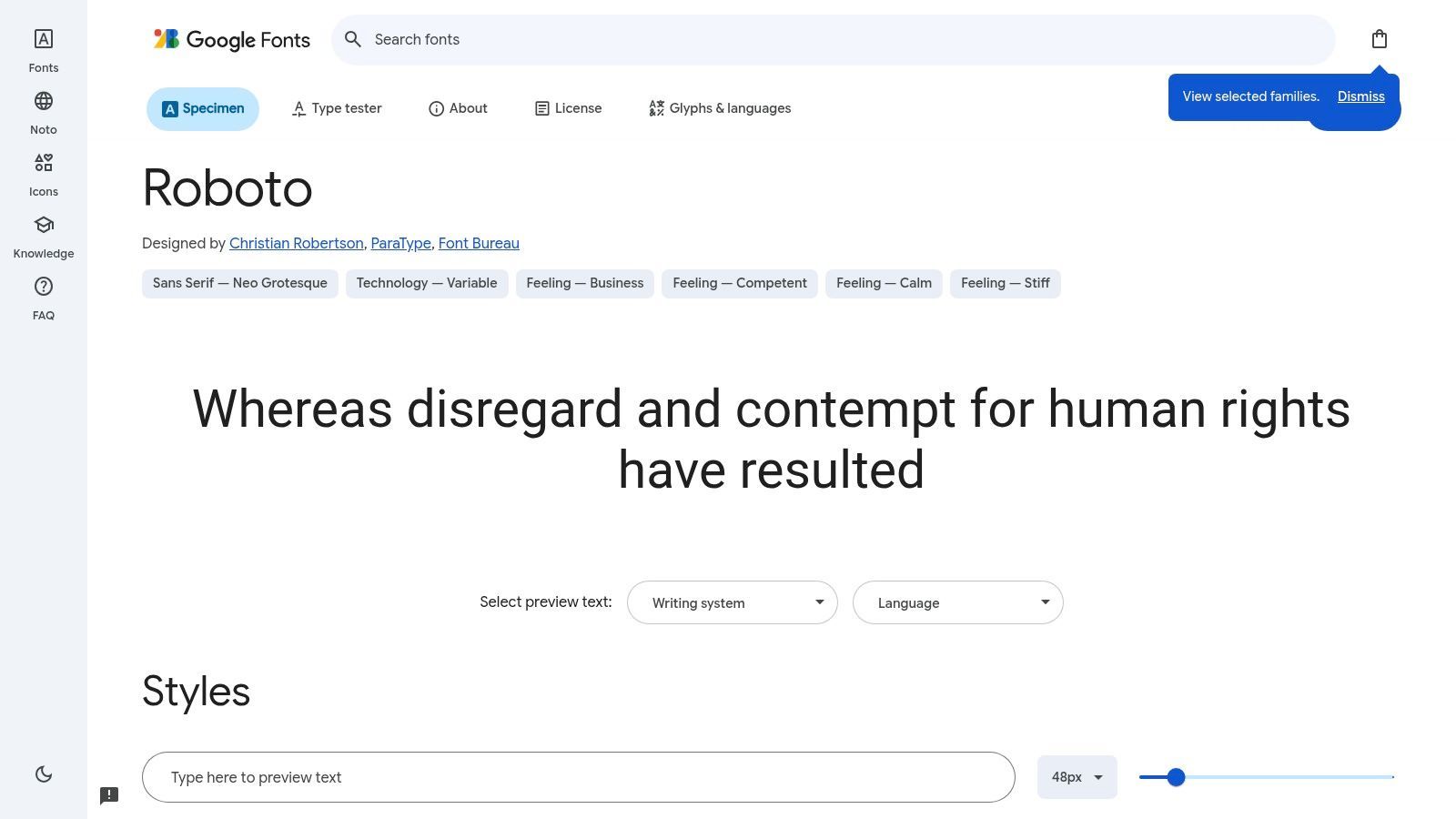
Kostenlos auf Google Fonts unter der Apache License verfügbar, ist Roboto ein Arbeitstier, das ohne Einschränkungen in jedem Projekt verwendet werden kann. Ihre extreme Popularität im Web und auf Android bedeutet, dass sie wahrscheinlich bereits auf dem Gerät eines Benutzers installiert ist, was die Wahrscheinlichkeit, dass Ihre Untertitel auf eine weniger lesbare Systemschriftart zurückfallen, erheblich reduziert. Diese Allgegenwart gewährleistet ein konsistentes Seherlebnis, insbesondere für Inhalte, die auf YouTube vertrieben oder auf Websites eingebettet werden.
Warum es für Untertitel funktioniert
Roboto schafft ein Gleichgewicht zwischen mechanischen, geometrischen Formen und freundlichen, humanistischen Kurven. Diese doppelte Natur ermöglicht es, neutral und unaufdringlich zu sein und gleichzeitig eine hervorragende Lesbarkeit zu gewährleisten. Die Buchstabenformen sind gut beabstandet und deutlich genug, um Überfüllung zu vermeiden, selbst wenn ein Hintergrundstrich oder eine Schatteneffekt angewendet wird. Für Videoproduzenten, die ein breites Publikum auf Mobilgeräten ansprechen, bietet Roboto ein natives Look-and-Feel, das sich nahtlos integriert.
Schlüsselerkenntnis: Die Stärke von Roboto ist seine Vertrautheit. Die Zuschauer sind es so gewohnt, sie auf ihren Handys und in Google-Apps zu sehen, dass sie fast unsichtbar wird und sie sich ganz auf den Inhalt des Dialogs konzentrieren können.
Implementierung und Größenanpassung
Robotos umfangreiche Familie, einschließlich Regular, Condensed und Mono-Varianten, bietet Flexibilität. Für Standarduntertitel ist die normale Breite ideal. Ihre klaren und robusten Formen halten sich bei verschiedenen Gewichten gut und bieten einen guten Kontrast zu geschäftigen Videohintergründen, ohne übermäßig fett sein zu müssen.
| Anwendungsfall | Empfohlenes Gewicht | Ideale Größe (relativ zu 1080p) | Hinweise |
|---|---|---|---|
| Standarddialog | Regular (400) | 46-54px | Ein großartiges Standardformat, das auf den meisten Bildschirmen heimisch wirkt. |
| Betonung/Schreien | Medium (500) | 50-58px | Bietet spürbare Betonung, ohne zu überwältigen. |
| Flüstern/Zwischenrufe | Light (300) | 42-48px | Kombinieren Sie mit Kursivschrift, um die Klarheit zu erhalten. |
Nachdem Sie Ihre Untertiteldatei mit einem Transkriptionsdienst generiert haben, können Sie Roboto in Ihrem Videobearbeitungsprogramm einstellen oder in der CSS Ihres Webplayers definieren. Ein wesentlicher Vorteil ist die Kombination mit der Noto-Schriftfamilie von Google für umfassende Sprachunterstützung über ihre nativen lateinischen, griechischen und kyrillischen Skripte hinaus. Die Verwendung der richtigen Video- und Audiotranskriptionstools kann Ihnen helfen, SRT- oder VTT-Dateien schnell zu exportieren, die dann für die Formatierung in Ihrem gewählten Editor bereit sind.
Website: https://fonts.google.com/specimen/Roboto
5. Open Sans (Steve Matteson)
Open Sans ist eine humanistische serifenlose Schriftart, die von Google in Auftrag gegeben und von Steve Matteson entworfen wurde. Ihre offenen Formen, weiten Öffnungen und die große x-Höhe wurden speziell für hervorragende Lesbarkeit auf Bildschirmen aller Größen entwickelt, von großen Monitoren bis hin zu kleinen mobilen Geräten. Dieser Fokus auf digitale Klarheit macht sie zu einem äußerst zuverlässigen und beliebten Kandidaten für die beste Schriftart für Untertitel, die sicherstellt, dass Ihr Text lesbar und freundlich ist.
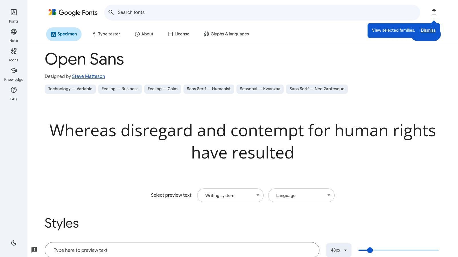
Als Flaggschiff-Google-Font ist Open Sans unter der Apache License 2.0 völlig kostenlos. Ihre weite Verfügbarkeit im Web bedeutet, dass mit ihr formatierte Untertitel für die überwiegende Mehrheit der Zuschauer korrekt gerendert werden, ohne die Schriftdatei einbetten zu müssen. Diese weit verbreitete Akzeptanz bietet ein konsistentes Seherlebnis über verschiedene Plattformen und Browser hinweg und reduziert unerwartete Schriftartenersetzungen.
Warum es für Untertitel funktioniert
Die Kernstärke von Open Sans ist seine "freundliche Neutralität". Sie präsentiert Informationen klar, ohne eine starke Persönlichkeit aufzudrängen, und ermöglicht es dem Videoinhalt, der primäre Fokus zu bleiben. Die Zeichen sind gut unterscheidbar und der großzügige Abstand verhindert, dass Buchstaben verschwimmen, was für schnelle Dialoge entscheidend ist. Ihre nachgewiesene Leistung auf Milliarden von Webseiten gibt Erstellern Vertrauen in ihre Lesbarkeit.
Schlüsselerkenntnis: Open Sans bietet ein sicheres, zugängliches und vertrautes Leseerlebnis. Ihre Allgegenwart ist ein Merkmal, kein Fehler, da sie die kognitive Belastung für Zuschauer reduziert, die es gewohnt sind, sie online zu sehen.
Implementierung und Größenanpassung
Open Sans ist als variable Schriftart verfügbar, die Ihnen eine detaillierte Kontrolle über Gewicht und Breite gibt. Diese Flexibilität ist großartig, um Untertitel an Markenrichtlinien anzupassen oder subtile Betonungen hinzuzufügen, ohne mehrere Schriftdateien zu benötigen. Ein leicht fetteres Gewicht kann oft die Lesbarkeit auf komplexen Videohintergründen verbessern.
| Anwendungsfall | Empfohlenes Gewicht | Ideale Größe (relativ zu 1080p) | Hinweise |
|---|---|---|---|
| Standarddialog | Regular (400) | 50-58px | Ihre offenen Buchstabenformen funktionieren bei dieser Größe gut. |
| Betonung/Schreien | SemiBold (600) | 54-62px | Bietet klare Betonung, ohne zu überwältigen. |
| Flüstern/Zwischenrufe | Light (300) | 44-50px | Kombinieren Sie mit Kursivschrift zur Unterscheidung. |
Nachdem Sie Ihre Untertitel in einem Tool wie Transcript.LOL erstellt und die SRT/VTT-Datei exportiert haben, können Sie Open Sans einfach anwenden. In Videobearbeitungsprogrammen ist sie fast immer als Systemschriftart verfügbar oder kann schnell installiert werden. Für webbasierte Videoplayer können Sie sie direkt von der Google Fonts API über einen einfachen CSS-Import aufrufen, was die Implementierung vereinfacht. Ihr breiter Zeichensatz umfasst lateinische, griechische, kyrillische und hebräische Schriften.
Website: https://fonts.google.com/specimen/Open+Sans
6. Verdana (Matthew Carter, Microsoft)
Verdana ist eine klassische humanistische serifenlose Schriftart, die vom legendären Matthew Carter für Microsoft entworfen wurde. Sie wurde von Anfang an für einen Zweck entwickelt: außergewöhnliche Lesbarkeit auf Computermonitoren mit geringer Auflösung zu gewährleisten. Ihre großzügige Breite, der weite Zeichenabstand und die große x-Höhe waren bahnbrechende Lösungen für Probleme der Klarheit auf dem Bildschirm in den 1990er Jahren, und diese gleichen Eigenschaften machen sie zu einer äußerst zuverlässigen Schriftart für Untertitel, insbesondere auf älteren Geräten.
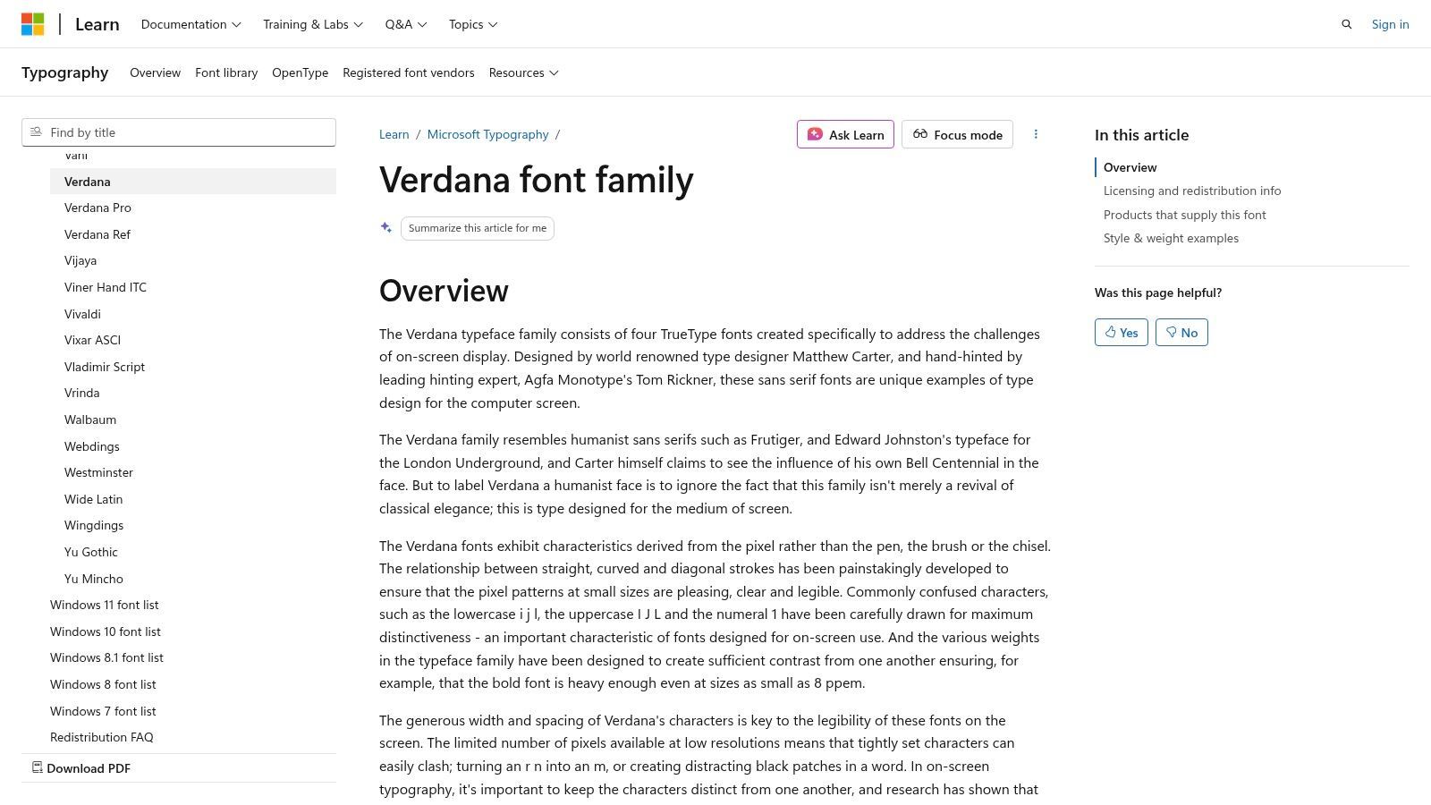
Als Schriftart, die mit Microsoft Windows und Office gebündelt ist, ist Verdana weit verbreitet, unterliegt jedoch einigen kommerziellen Lizenzbeschränkungen bei der Weiterverbreitung. Obwohl Sie sie in der Regel problemlos für Videoinhalte verwenden können, kann die Einbettung in eine Webanwendung oder ein Gerät eine spezielle Lizenz erfordern. Ihre Allgegenwart in Unternehmensumgebungen macht sie jedoch zu einer sicheren und vertrauten Wahl für interne Schulungsvideos oder Präsentationen, bei denen Konsistenz über Windows-Maschinen hinweg entscheidend ist.
Warum es für Untertitel funktioniert
Die Kernstärke von Verdana ist ihre Widerstandsfähigkeit gegen Mehrdeutigkeit. Die Buchstabenformen wurden so gezeichnet, dass sie selbst bei winzigen Größen so deutlich wie möglich sind. Zum Beispiel sind der Großbuchstabe 'I', der Kleinbuchstabe 'l' und die Zahl '1' alle leicht unterscheidbar, was Fehlinterpretationen bei schnellen Dialogen verhindert. Diese handgehintete Präzision sorgt dafür, dass Zeichen gestochen scharf bleiben und nicht verschwimmen, eine entscheidende Funktion zur Aufrechterhaltung der Lesbarkeit vor komplexen Videohintergründen.
Schlüsselerkenntnis: Verdana ist die ultimative Fallback-Schriftart. Wenn Sie das Gerät oder die Anzeigequalität des Betrachters nicht kontrollieren können, bietet ihr breites, klares Design ein Sicherheitsnetz und stellt sicher, dass Ihre Untertitel unter weniger als idealen Bedingungen lesbar bleiben.
Implementierung und Größenanpassung
Verdanas Einfachheit ist ihre Tugend. Sie bietet nicht die umfangreichen Gewichte einer modernen variablen Schriftart, daher konzentriert sich die Implementierung auf ihre Kernstile Regular und Bold. Ihr großzügiger integrierter Abstand bedeutet, dass Sie selten zusätzlichen Abstand hinzufügen müssen. Bei der Erstellung von Untertiteln sollten Sie bedenken, dass ihre breiten Zeichen mehr horizontalen Platz beanspruchen als eine schmale Schriftart wie Arial.
| Anwendungsfall | Empfohlenes Gewicht | Ideale Größe (relativ zu 1080p) | Hinweise |
|---|---|---|---|
| Standarddialog | Regular | 50-58px | Ihre natürliche Breite macht sie bei dieser Größe klar. |
| Betonung/Schreien | Bold | 54-62px | Bietet starken Kontrast, ohne die Klarheit zu verlieren. |
| Legacy-Display | Regular | 46-52px | Hervorragend geeignet, wo andere Schriftarten verschwimmen oder verpixeln könnten. |
Wenn Sie ein Tool wie Transcript.LOL verwenden, um Ihre SRT- oder VTT-Dateien zu generieren, können Sie Verdana einfach in Ihrer Videobearbeitungssoftware anwenden. Da es sich auf fast allen Windows- und macOS-Maschinen um eine Systemschriftart handelt, können Sie sicher sein, dass sie für einen großen Teil Ihres Publikums korrekt gerendert wird. Wenn Sie Fragen zu Dateiformaten haben, finden Sie in unseren FAQs Antworten auf die Unterschiede zwischen VTT und SRT.
Website: https://learn.microsoft.com/en-us/typography/font-list/verdana
7. Atkinson Hyperlegible (Braille Institute)
Atkinson Hyperlegible ist eine serifenlose Schriftart, die vom Braille Institute mit einem einzigen Ziel entworfen wurde: die Lesbarkeit für sehbehinderte Leser zu maximieren. Jedes Zeichen wurde absichtlich so gezeichnet, dass es so deutlich wie möglich ist, wodurch häufige Verwechslungen zwischen Buchstaben wie 'I', 'l' und '1' drastisch reduziert werden. Dieser barrierefreie Ansatz macht sie zu einer hervorragenden und mitfühlenden Wahl für Untertitel und gewährleistet Klarheit für ein möglichst breites Publikum.
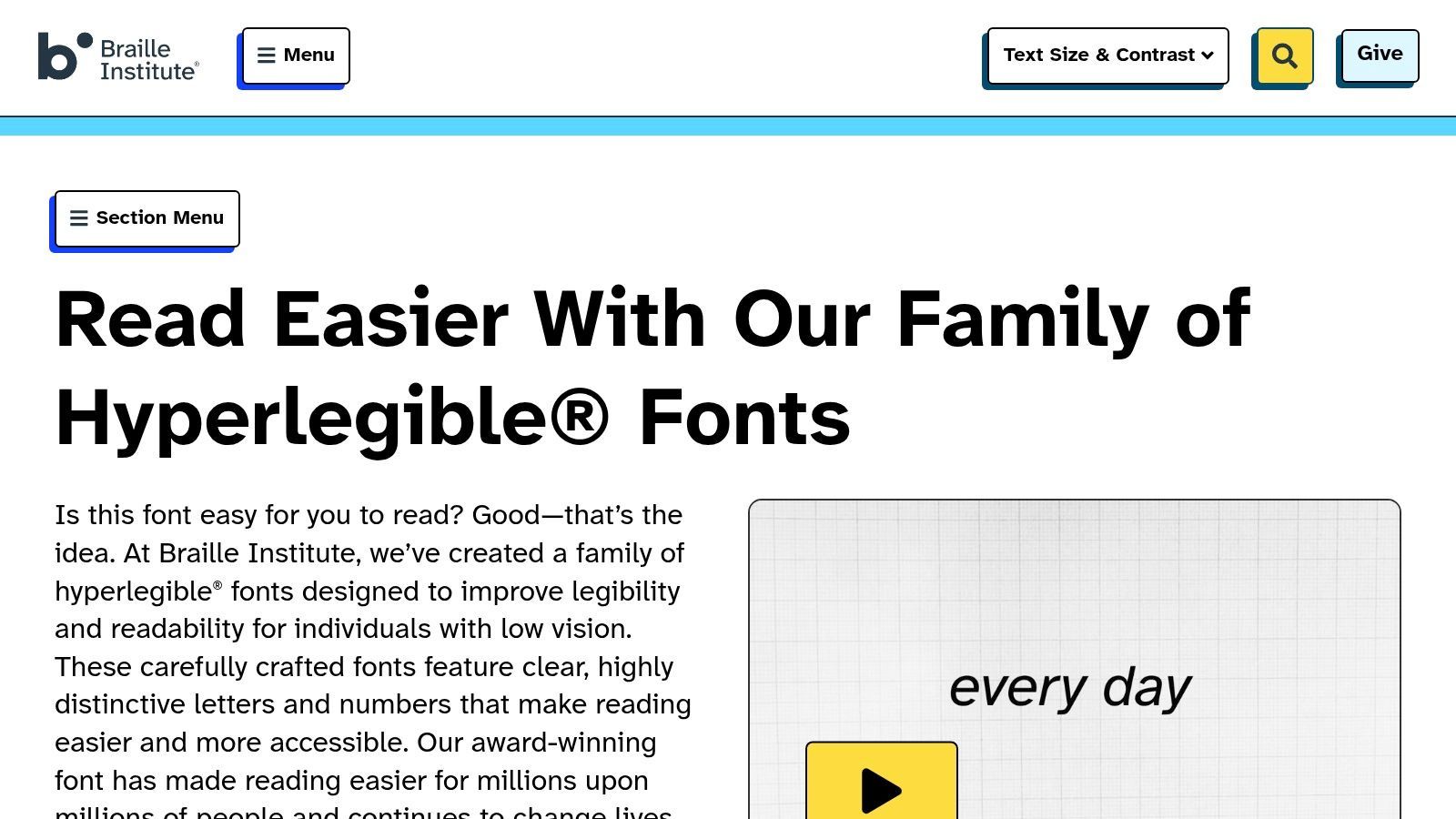
Als kostenlose und Open-Source-Schriftart unter der SIL Open Font License ist Atkinson Hyperlegible für jedes persönliche oder kommerzielle Projekt kostenlos erhältlich. Das Braille Institute pflegt sie aktiv, wobei die Veröffentlichung "Next" im Jahr 2025 ihre Gewichtungsoptionen erweitert, was wertvolle Styling-Flexibilität für Untertitel hinzufügt. Diese Schriftart ist ein starkes Signal dafür, dass Ihre Inhalte Barrierefreiheit priorisieren, was sie ideal für Bildungs-, Gesundheits- oder Regierungs-bezogene Videos macht.
Warum es für Untertitel funktioniert
Die Stärke der Schriftart liegt in ihrem zweckbestimmten Design. Im Gegensatz zu Schriftarten, die für die Lesbarkeit angepasst wurden, entstand Atkinson Hyperlegible aus ihr. Ihre unzweideutigen Buchstabenformen, der großzügige Abstand und die klaren Strichunterschiede sorgen dafür, dass Text auch unter schwierigen Bedingungen lesbar bleibt, z. B. auf kleinen mobilen Bildschirmen, Displays mit geringer Auflösung oder für Zuschauer mit Sehbehinderungen. Ihre etwas ausgeprägteren Zeichenformen heben sich von komplexen Videohintergründen ab.
Schlüsselerkenntnis: Atkinson Hyperlegible ist nicht nur eine Schriftartwahl; es ist eine Aussage zur Barrierefreiheit. Sie priorisiert die Bedürfnisse von sehbehinderten Zuschauern, ohne die ästhetische Qualität für alle anderen zu beeinträchtigen.
Implementierung und Größenanpassung
Die erweiterten Gewichte in der "Next"-Version sind entscheidend für das Untertitel-Styling. Die Verwendung eines fetteren Gewichts für Betonungen ist jetzt viel effektiver. Wenn Sie bereit sind, Ihren Videos Untertitel hinzuzufügen, können Sie den Text mit einem Tool wie Transcript.LOL vorbereiten, was die Erstellung und den Export von Untertiteldateien vereinfacht. Detaillierte Anweisungen zu den unterstützten Exportformaten finden Sie in der offiziellen Dokumentation.
| Anwendungsfall | Empfohlenes Gewicht | Ideale Größe (relativ zu 1080p) | Hinweise |
|---|---|---|---|
| Standarddialog | Regular | 50-58px | Ihre inhärente Klarheit ermöglicht eine solide Präsenz. |
| Betonung/Schreien | Bold | 54-62px | Bietet klare Unterscheidung, ohne blockig zu werden. |
| Flüstern/Zwischenrufe | Regular | 44-50px | Kombinieren Sie mit Kursivschrift für subtile Unterscheidung. |
Um die Schriftart anzuwenden, geben Sie Atkinson Hyperlegible in Ihrer Videobearbeitungssoftware oder über CSS für einen webbasierten Videoplayer an. Während sie eine starke Unterstützung für lateinische Skripte bietet, denken Sie daran, sie mit einer Begleitschrift zu kombinieren, wenn Ihr Projekt CJK oder andere nicht-lateinische Zeichensätze benötigt.
Website: https://www.brailleinstitute.org/freefont/
Top 7 Schriftarten für Untertitel — Vergleich
| Schriftart | Implementierungskomplexität 🔄 | Ressourcenanforderungen ⚡ | Erwartete Ergebnisse 📊⭐ | Ideale Anwendungsfälle 💡 | Hauptvorteile ⭐ |
|---|---|---|---|---|---|
| Inter (Rasmus Andersson) | Niedrig — einfach selbst zu hosten; variable Achsen erfordern moderne Renderer | Moderat — variable Schriftart mit ca. 2.000 Glyphen; lateinisch-zentriert (benötigt Begleiter für CJK) | Gestochen scharfe Darstellung von Kleinbuchstaben; zuverlässiger Untertitel-Standard | Web- und mobile Untertitel für lateinische Skripte; UI-Beschriftungen | Bildschirmoptimiertes Hinting; variable Gewichtung/Neigung; Open-Source |
| Noto Sans (Google) | Mittel — erfordert Auswahl/Kombination geeigneter Unterfamilien (z. B. CJK) | Hoch — massive Skriptabdeckung; Subset für Web empfohlen ⚡ | Konsistente sprachübergreifende Untertitel über Skripte hinweg | Mehrsprachige/Broadcast-Untertitel, einschließlich CJK und globaler Pipelines | Deckt praktisch alle Skripte ab; aktiv gepflegt; kostenlos |
| Source Sans 3 (Adobe) | Niedrig — einfache Einbettung; vorhersehbare Metriken | Moderat — vollständige LGC-Familie mit variablen Optionen | Vorhersehbare Umbrüche und Zeitsteuerung; gute Lesbarkeit bei Untertitelgrößen | UI/Untertitel für Lateinisch/Griechisch/Kyrillisch; Adobe/Google Fonts-Ökosysteme | Ausgereifte Metriken; zuverlässiges Hinting; Open-Source |
| Roboto (Google) | Niedrig — allgegenwärtig auf Android/Chrome; einfach bereitzustellen | Moderat — mehrere Varianten (Flex, Condensed usw.); Kombination für Nicht-LGC | Konsistente Darstellung auf Android/Web; solide Lesbarkeit bei kleinen Größen | Android-First-Apps und mobile/Web-Untertitel | Äußerst verbreitet (reduziert Fallbacks); gute Klarheit bei kleinen Größen |
| Open Sans (Steve Matteson) | Niedrig — einfach selbst zu hosten oder über CDN zu bedienen | Moderat — variable Schriftart verfügbar; breite LGC-Unterstützung | Neutrale, sehr gut lesbare Untertitel, die sich in den Inhalt einfügen | Web-Untertitel, die Neutralität und breite Kompatibilität erfordern | Nachgewiesene Lesbarkeit; breite Ökosystemunterstützung; kostenlos |
| Verdana (Matthew Carter) | Niedrig unter Windows; Weiterverbreitung kann für gebündelte Nutzung eingeschränkt sein | Niedrig — für Legacy-/Low-Res-Renderer entwickelt; kompakte Familie | Hervorragende Lesbarkeit auf Low-Resolution- oder Legacy-Playern | Fallback auf veralteten Geräten/Playern; Situationen, die maximale Glyphenunterscheidung erfordern | Entwickelt für kleine Größen; breiter Abstand reduziert Zeichenverwechslungen |
| Atkinson Hyperlegible (Braille Institute) | Niedrig — einfach einzubetten; unterschiedliche Designüberlegungen für Branding | Niedrig–Moderat — mehrere Gewichte (Next, Mono), aber nicht riesig | Maximierte Zeichenunterscheidung für sehbehinderte Zuschauer | Barrierefreiheitskritische Untertitel (Gesundheit, Bildung, Regierung) | Barrierefreiheits-erste Buchstabenformen; starke Unterscheidung; kostenlos |
Von der Schriftartwahl bis zum fertigen Schnitt: Optimierung Ihres Untertitel-Workflows
Die Wahl der besten Schriftart für Untertitel ist eine kritische Designentscheidung, die die Erfahrung Ihres Publikums direkt beeinflusst. In diesem Leitfaden haben wir eine kuratierte Auswahl an Schriftarten untersucht, von der modernen Klarheit von Inter und Roboto bis zur unübertroffenen Zugänglichkeit von Atkinson Hyperlegible. Jede Schriftart bietet eine Reihe von Vorteilen, unabhängig davon, ob Sie die globale Sprachunterstützung mit Noto Sans oder die klassische Lesbarkeit auf dem Bildschirm mit Verdana priorisieren.
Das zentrale Thema ist klar: Eine großartige Untertitelschriftart muss lesbar, neutral und vielseitig sein. Sie sollte den Inhalt unterstützen, ohne ihn abzulenken. Faktoren wie eine großzügige x-Höhe, offene Zähler und eine klare Unterscheidung zwischen ähnlichen Zeichen (wie 'I', 'l' und '1') sind nicht nur typografische Details; sie sind das Fundament barrierefreier Kommunikation. Ihre endgültige Wahl hängt von Ihrem spezifischen Publikum, den von Ihnen verwendeten Plattformen und der Ästhetik Ihrer Marke ab.
Wichtige Erkenntnisse für Ihr nächstes Projekt
Um dieses Wissen in die Praxis umzusetzen, denken Sie an diese Kernprinzipien:
- Priorisieren Sie die Lesbarkeit über alles andere: Stil ist zweitrangig. Wenn Zuschauer Schwierigkeiten haben, den Text zu lesen, hat die Schriftart versagt. Testen Sie Ihre gewählte Schriftart auf verschiedenen Bildschirmgrößen und Geräten, bevor Sie sich festlegen.
- Berücksichtigen Sie den Kontext: Eine Schriftart, die für eine filmische YouTube-Dokumentation funktioniert, ist möglicherweise nicht die beste Wahl für einen schnellen TikTok-Clip. Passen Sie die Persönlichkeit der Schriftart an den Ton und die Betrachtungsumgebung des Videos an.
- Barrierefreiheit ist nicht verhandelbar: Schriftarten wie Atkinson Hyperlegible sind speziell für sehbehinderte Zuschauer konzipiert, aber Prinzipien wie guter Kontrast und einfache Formen kommen allen zugute. Die Integration von Barrierefreiheit von Anfang an in Ihren Workflow erweitert Ihre Reichweite und schafft ein inklusiveres Erlebnis.
Von der Auswahl bis zur Implementierung
Sobald Sie die perfekte Schriftart ausgewählt haben, besteht der nächste Schritt darin, die eigentliche Untertiteldatei zu erstellen. Dies ist oft der zeitaufwändigste Teil des Prozesses und beinhaltet manuelle Transkription und präzises Timing. Hier können moderne Tools Ihren Workflow jedoch vollständig verändern. Anstatt Stunden mit Tippen und Synchronisieren von Text zu verbringen, können Sie die schwere Arbeit automatisieren.
Manual Captioning Wastes Time
Hand-typing subtitles is slow, error-prone, and difficult to maintain at scale. Even small timing mistakes can quickly add up, disrupting the viewing experience and frustrating your audience. Automation isn’t just faster, it also ensures greater reliability, consistency, and efficiency across all your content.
An efficient process involves generating an accurate transcript with timestamps first, then applying your chosen font during the video editing stage. This separation of tasks ensures both speed and quality. By using a dedicated transcription service, you can get a near-perfect SRT or VTT file in minutes, freeing you to focus on the creative aspects of your video, like finalizing font size, color, and placement to ensure your subtitles are as professional and readable as possible.
Features for Professional Subtitles
Sprechererkennung
Identifiziere automatisch verschiedene Sprecher in deinen Aufnahmen und beschrifte sie mit ihren Namen.
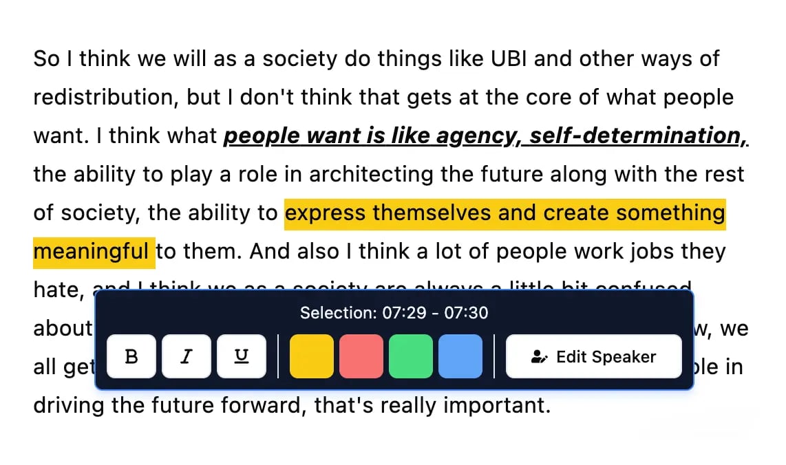
Bearbeitungswerkzeuge
Bearbeite Transkripte mit leistungsstarken Werkzeugen wie Suchen und Ersetzen, Sprecherzuordnung, Rich-Text-Formate und Hervorhebungen.
Zusammenfassungen und Chatbot
Erstelle Zusammenfassungen und andere Erkenntnisse aus deinem Transkript, wiederverwendbare benutzerdefinierte Prompts und Chatbot für deine Inhalte.
Ready to stop manually transcribing and start creating perfect subtitles faster? Transcript.LOL generates highly accurate, time-stamped transcripts and SRT/VTT files from your video or audio in minutes. Upload your content and see how simple it is to get your captioning workflow started at Transcript.LOL.